Wok N Roll
A brand identity for a fresh-ingredient stir-fry meal service, built around a wordmark that translates East Asian cuisine into something everyone can read.
CLIENT
Collaboration DRPG
SCOPE
Brand identity
Wordmark
Packaging
Web
ROLE
Brand Designer
THE BRIEF
Wok N Roll is a fresh-ingredient meal-kit concept developed through a creative collaboration with DRPG, one of the UK's largest independent creative communications agencies. The product proposition was simple and tightly defined: a service that delivers fresh, pre-prepared ingredients to the customer's door, ready to be tipped into a home wok for an authentic stir-fry.
I was given the name Wok N Roll and one creative principle: the identity needed to honour the East Asian origins of the cuisine without resorting to the visual clichés that meal-kit and fast-casual brands typically reach for. Everything else, visual system, packaging, digital, and applications, needed to be developed from scratch.
That principle was the harder constraint. Stereotyping East Asian visual language is one of the most common failures in food branding, and avoiding it required a conceptual approach rather than a stylistic one.
PROCESS
The identity needed a foundation that would let every other element follow from it. The starting point became a question: could the wordmark itself become a metaphor for the product?
The product proposition was, at its core, an act of translation. Authentic East Asian stir-fry, prepped and made accessible to home cooks who might find the cuisine intimidating to source or prepare. The brand needed to do the same job visually, honour the heritage of the cuisine while making it feel approachable.
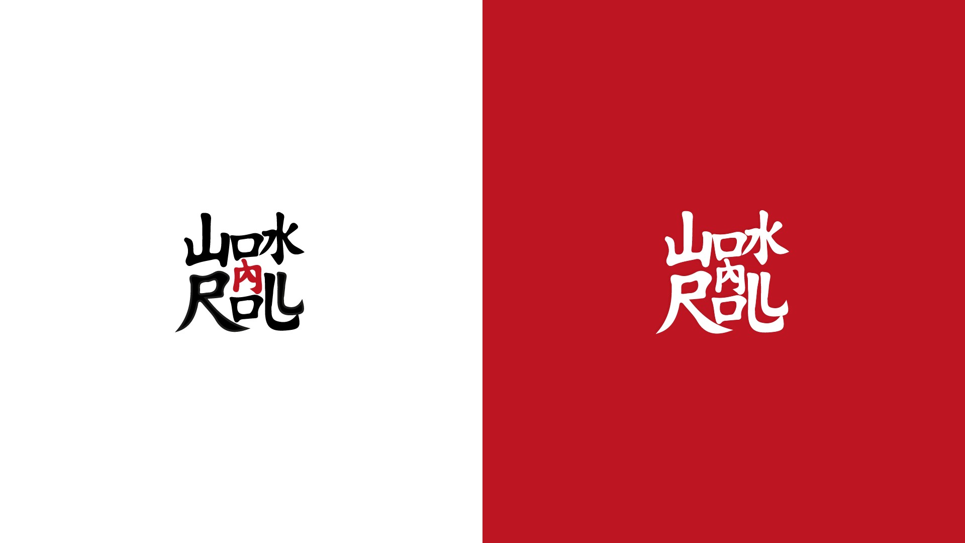
The result was a custom wordmark built using Kanji-inspired forms, the logographic script widely used across East Asia, to spell out "WOK N ROLL" in Latin letters. Each glyph operates on two levels simultaneously. To a Western viewer, the marks resolve into the letters W, O, K, N, R, O, L, L, reading "Wok N Roll" in clean Latin script. To anyone familiar with East Asian calligraphy, the construction draws directly from Kanji's brushstroke logic and structural composition.
THE APPROACH
The wordmark is the product proposition: East Asian cuisine, translated into something everyone can understand and make at home. The brand mark performs the act of translation that the meal kit performs in the kitchen.
That meant the East Asian heritage wasn't applied as a decorative layer or a stylistic flourish, it was built into the structure of the brand mark itself, and into the brand's reason for existing. The identity respects its source by treating East Asian typography as a system to learn from, not an aesthetic to borrow from.
COLOUR AND PATTERN
The wordmark was deployed in two key configurations: a black version for clean digital and print application, and a white version against a deep red, geometric-pattern background, a colour and pattern combination drawn from East Asian celebratory and packaging traditions.
The red carries cultural weight, used in East Asian wedding, festival, and gift packaging. It also gives the brand instant visual confidence. The repeating geometric pattern provides texture and authenticity without using imagery that would feel costumed.
APPLICATION ACROSS THE BRAND
With the central concept locked in, the rest of the identity extended outward consistently.
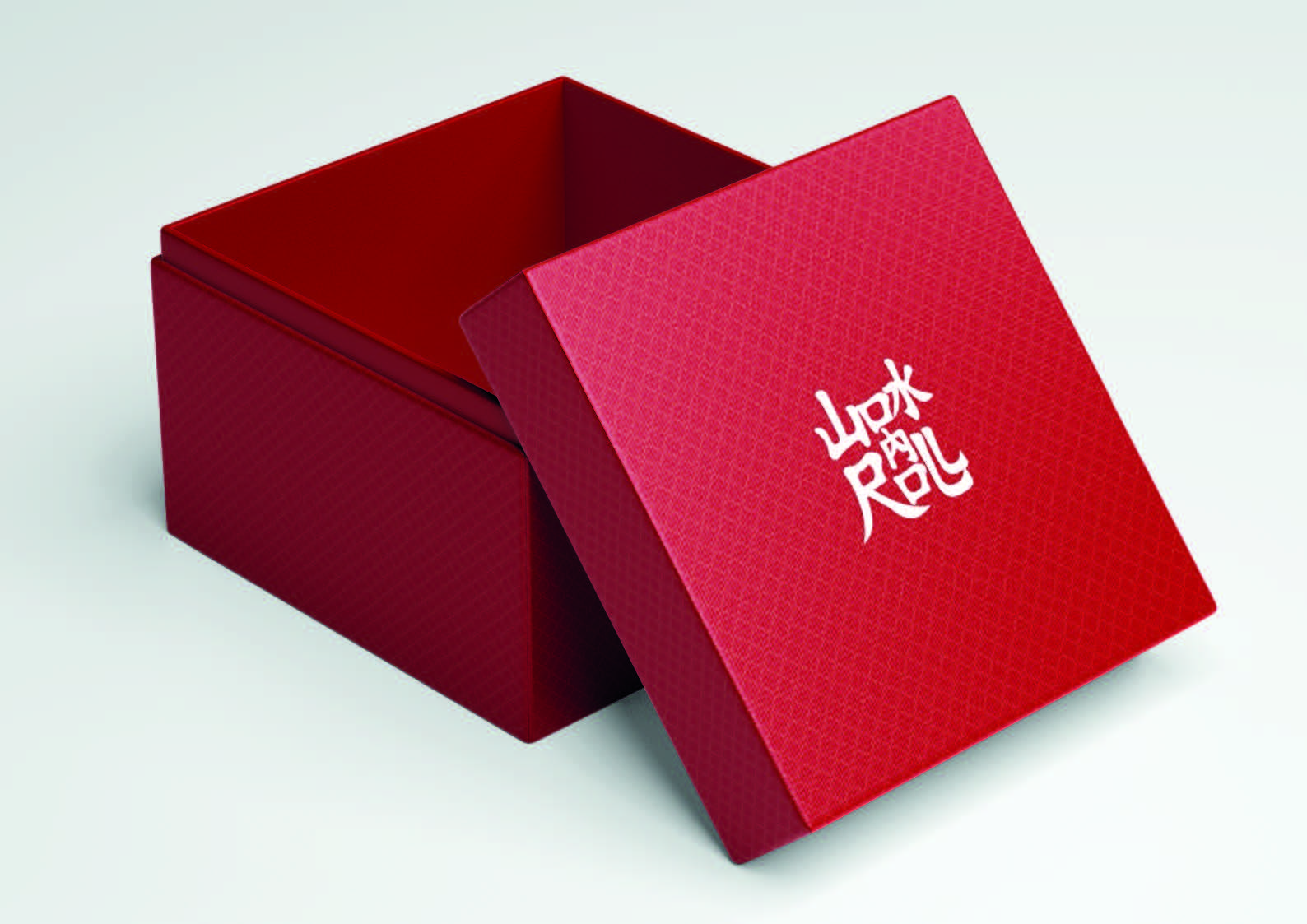
Packaging
A bold red presentation box with the white wordmark applied minimally to the lid. The interior surface uses a deeper red, creating a layered, considered unboxing experience that elevates the meal-kit format above its supermarket competition.
Recipe Cards
Each meal kit ships with an illustrated recipe card matching the visual system, giving the customer both ingredients and the guidance to use them confidently.
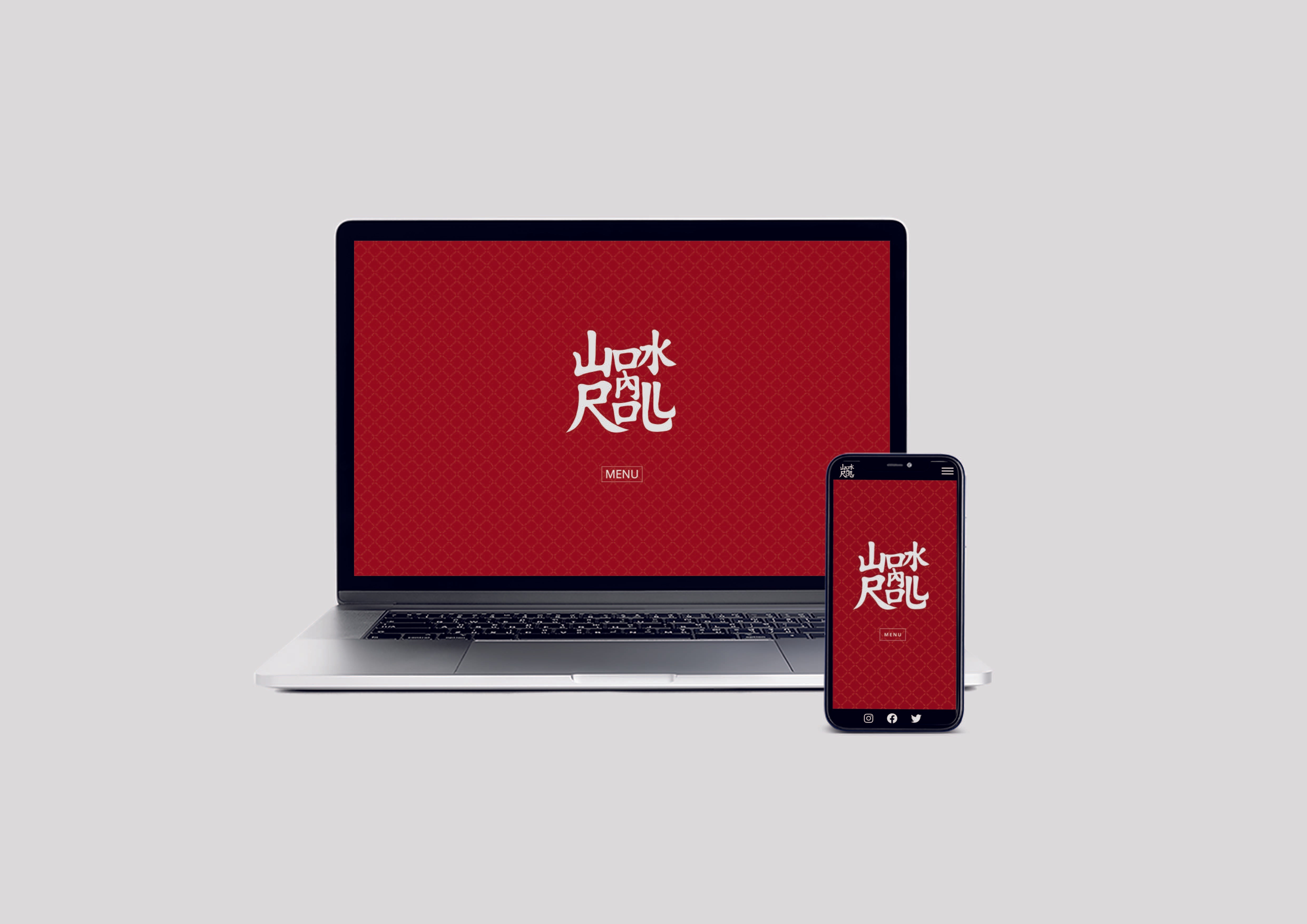
App Interface
A mobile app for ordering, with the wordmark anchoring the splash screen and a streamlined ordering flow. The deep red brand colour carries through the digital experience.
Brand Website
A web home for the service that introduced the brand, the product proposition, and the ordering flow to first-time customers.

THE OUTCOME
Wok N Roll was an exercise in solving a culturally-rooted brand problem from first principles. Working with only a name, the work needed to define what the brand stood for, how it should look, and how it should behave across digital and physical applications, all while navigating cultural authenticity carefully.
The final identity was presented to the team at DRPG. The project sits in the portfolio as an early example of identity work that starts from concept rather than aesthetic, building meaning into the structure of the mark itself, not just the surface of the design.