MyVerse
Brand identity for an independent music label.

CLIENT
Independent label founder
SCOPE
Naming
Identity system
Sub-brand architecture
Social and product application
ROLE
Brand Designer (commissioned)
THE BRIEF
The founder of a new independent music label approached me with a values-led proposition: a Wolverhampton-based label that would platform underrepresented voices in music, with a particular focus on women, artists too often pushed to the margins of an industry that has historically been built around them but rarely for them.
What the founder needed was a brand from the ground up. That included the name. The label didn't yet exist as a public-facing entity, and the visual identity, voice, and applications all had to be built without an established starting point. The only fixed point was the values: diversity, inclusivity, and giving space to artists who hadn't been given it elsewhere.
PROCESS
Naming: from concept to wordmark
The starting point for the name was the founder's own framing of the label: a place for myriad diverse voices. That phrase carried the thesis of the entire project, multiplicity, difference, range, and it became the etymological root of the name itself.
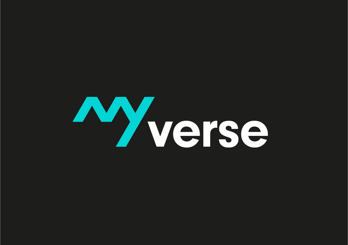
Myriad diverse → MyVerse.
The contraction does three things at once. It shortens the phrase into something pronounceable and memorable. It contains "verse", a word with deep musical and lyrical association, repositioning the brand from corporate label to artistic platform. And the "My" prefix introduces a first-person voice that becomes the foundation of the entire sub-brand system.
The name carries the founding thesis inside it. That's what a values-driven brand name should do.

THE "My" FRAMEWORK
Once the name was established, the prefix unlocked a sub-brand architecture that mapped directly to how the label would communicate with its audiences:
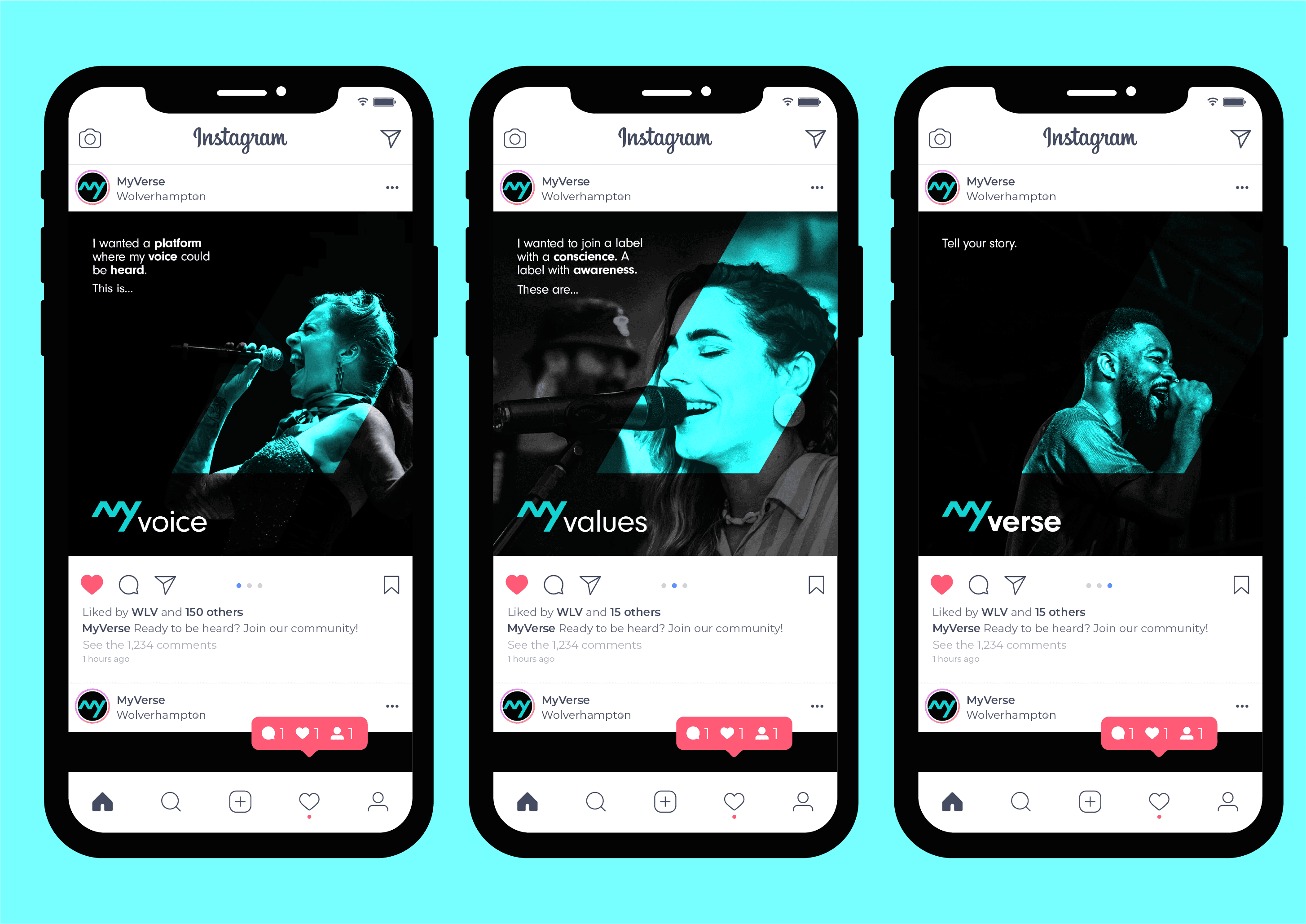
MyVoice: "My voice will be heard." The platform for the artists themselves: their stories, their perspectives, their work.
MyValues: "My values shape the label." The principles the label stands for: inclusivity, diversity, and space for those previously denied it.
MyVerse: "My verse is my song." The parent brand and a direct reference to the artist's own creative output.
Each lockup uses the same custom "MY" mark with the relevant suffix in a clean, lowercase contemporary sans-serif. The system is intentionally simple: the visual hierarchy stays consistent across all three, with only the suffix and contextual imagery changing. That consistency is what makes it work as a campaign system rather than three separate logos.
VISUAL IDENTITY
The primary mark is a custom angular wordmark for "MY", built from clean diagonal strokes that read as letterforms but also as a graphic mark in their own right. The angles give the identity energy and directness; the geometry keeps it sharp and premium.
The colour story is restrained and confident: mint green against deep black, with white reserved for typography and supporting elements. The mint isn't a typical music-label colour. Most labels lean toward black-and-white minimalism or saturated genre conventions. The mint signals freshness, growth, and a deliberate departure from the industry visual norm. Against the black, it reads as alive without becoming ornamental.
APPLICATION ACROSS FORMATS
The identity was designed to flex across the channels where independent labels actually live: social-first, mobile-first, with selective physical applications.
Instagram campaign templates: A repeatable layout system using the MyVoice / MyValues / MyVerse sub-brands as content categories. Each post pairs a duotone mint-and-black portrait with a first-person quote and the relevant sub-brand lockup. The system gives the label a recognisable feed identity from day one.
Vinyl sleeve artwork: A debut-release sleeve concept featuring handwritten title typography ("joy") on deep black, with the MyVerse mark anchoring the lower corner. The mint label on the vinyl itself ties the physical product back to the brand colour story without overstating it.
Brand mark variations: The "MY" mark works as a standalone identifier, a profile picture, a watermark, and a reverse-out lockup against the black backgrounds the label uses across its content.

THE OUTCOME
The full identity system, naming, primary mark, sub-brand architecture, colour story, social templates, and product application, was delivered to the founder for launch. The system was built to be self-contained and extendable, allowing the founder to roll out across artists, releases, and campaigns without requiring further design support for routine application.
Working on a values-led brand from naming through to physical product is rare. Most identity work begins with a brief that's already half-decided. This project was an exercise in building meaning into every layer of the brand, starting with the word itself.