Jack the Ripper
Campaign identity and multi-format launch advertising for the UK's leading escape room brand.

CLIENT
Escape Live
PROJECT YEAR
2024
SCOPE
Campaign identity
Multi-format advertising
UK-wide rollout
Strategy
THE BRIEF
When Escape Live announced the Birmingham launch of their new Jack the Ripper escape room, the campaign needed to do two things at once: communicate the gothic, blood-stained atmosphere of Whitechapel in 1888, and drive bookings through the brand's marketing channels.
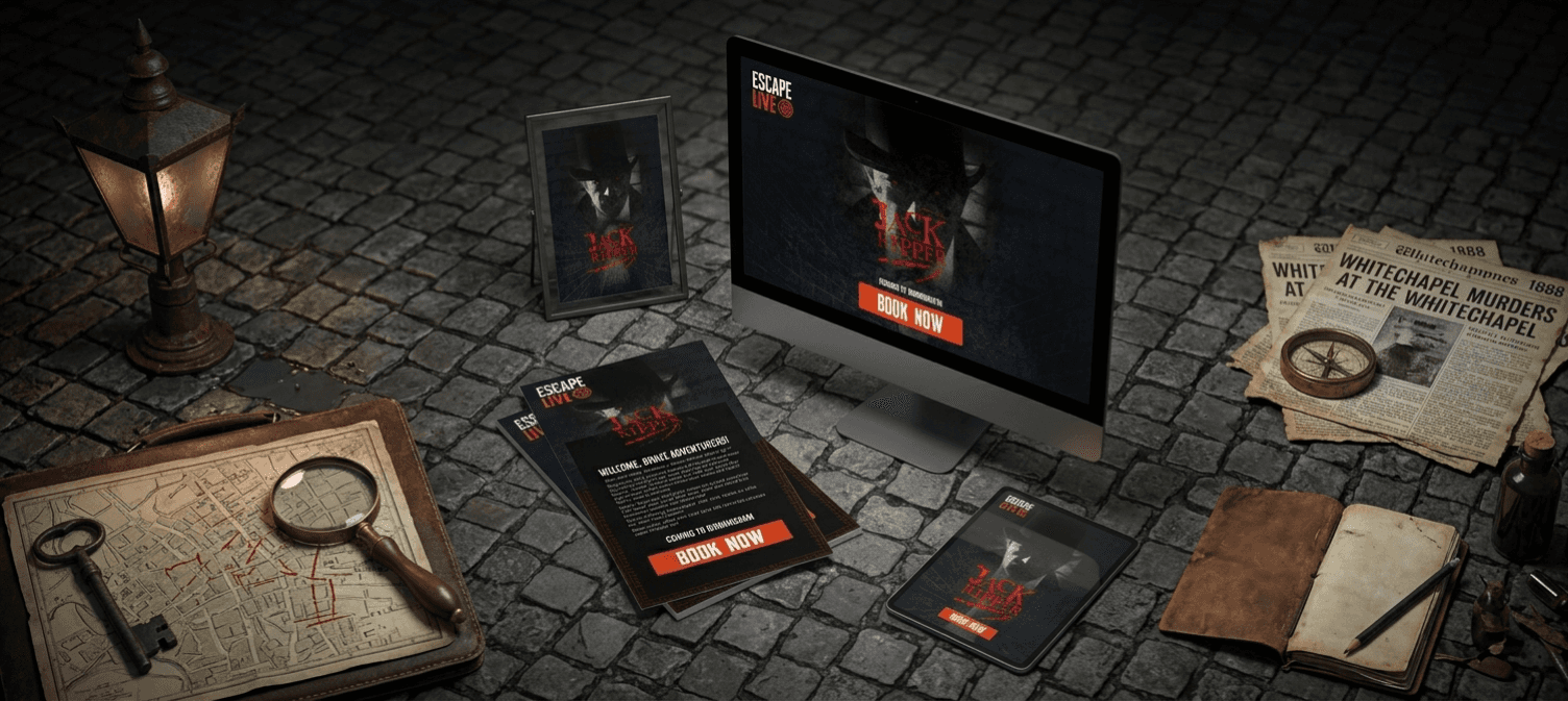
The campaign rolled out across multiple formats simultaneously. Square assets for paid social, vertical mobile-first creative, email banners with embedded CTAs, full poster designs, and a Birmingham-specific "Coming Soon" announcement series. Each format needed to feel like part of the same campaign while solving the specific job of its placement.
THE APPROACH
The Jack the Ripper story is one of the most recognisable in true crime, which is both an opportunity and a trap. Going too literal risks looking like every other Ripper-themed product on the market. Going too abstract loses the visceral hook that makes the property exciting in the first place.
ATMOSPHERE OVER ICONOGRAPHY
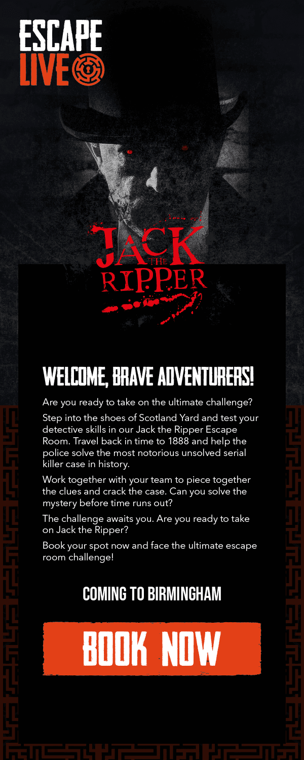
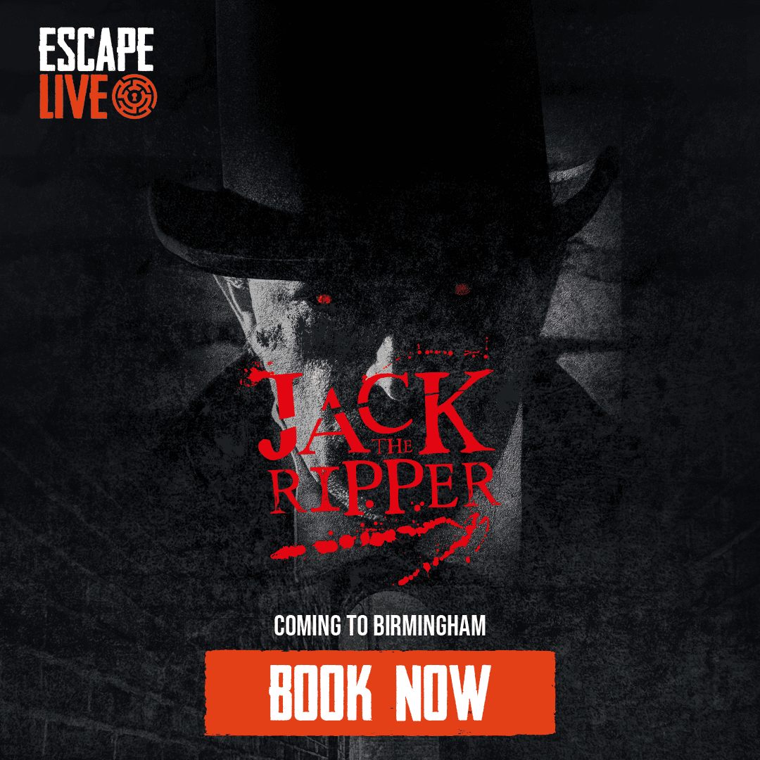
Rather than leaning on top hats, magnifying glasses, and other Victorian detective clichés, the visual language was built around mood, fog, brick, shadow, and the sense of being watched. The villain appears as a presence rather than a character, which lets the audience's imagination do the heavy lifting.
ONE SHOCKING COLOUR AGAINST MONOCHROME
The campaign palette was almost entirely greyscale, slate brick, dense black, fog white. Blood red was reserved exclusively for the typographic title lockup and supporting accents. This made the title treatment unmissable while keeping the rest of the composition restrained and atmospheric.
DESIGNED FOR THE CHANNEL
The campaign was built to work across the full Escape Live marketing ecosystem.
Vertical email banner with CTA — Designed for mobile-first email rendering, with the character art pushed to the upper portion and a high-contrast orange "Book Now" button anchoring the bottom. The atmospheric brick maze pattern continues behind the message text to maintain campaign cohesion without competing with the booking CTA.
Square social posts — A tighter crop of the hero composition with the "Coming to Birmingham" geo-targeting message worked into the hierarchy. Designed to stop the scroll on Instagram and Facebook feeds while driving toward the booking CTA.
Full poster — The widest atmospheric treatment, with maximum negative space around the typographic lockup to let the campaign breathe at large display sizes.
SUMMARY
The campaign rolled out across Escape Live's full marketing channels for the Birmingham launch, in-venue display, paid social, email marketing, and partner placements.
The visual system was designed to be extendable for future game launches, with the same campaign architecture later applied to Escape Live's Halloween series (Escape Evil) and family seasonal campaigns (Trick or Treat).