HuB
Self-initiated brand identity for a local marketplace platform.

CLIENT
Self-initiated
SCOPE
Brand strategy
Naming
Logo system
Sub-brand architecture
Advertising creative
Packaging
Web design
ROLE
Concept
Naming
Brand Designer
The premise
HuB is a self-initiated project that started with an observation: most marketplace platforms compete on scale and convenience, but very few are designed visually around what makes local commerce different, the relationship between a neighbourhood and the independent businesses that serve it.
I set myself the brief: develop a complete brand identity for a hypothetical marketplace platform that connects consumers directly with their local independent businesses for home delivery. The platform would be deliberately location-agnostic, designed to deploy in any city or region, not tied to a specific market.
The project covered everything from the name to the advertising rollout, all developed from scratch with no external brief.
THE APPROACH
The platform's purpose was structural, it sat between two parties (homes and businesses) and made the connection happen. The name needed to communicate that role directly without being descriptive to the point of dullness.
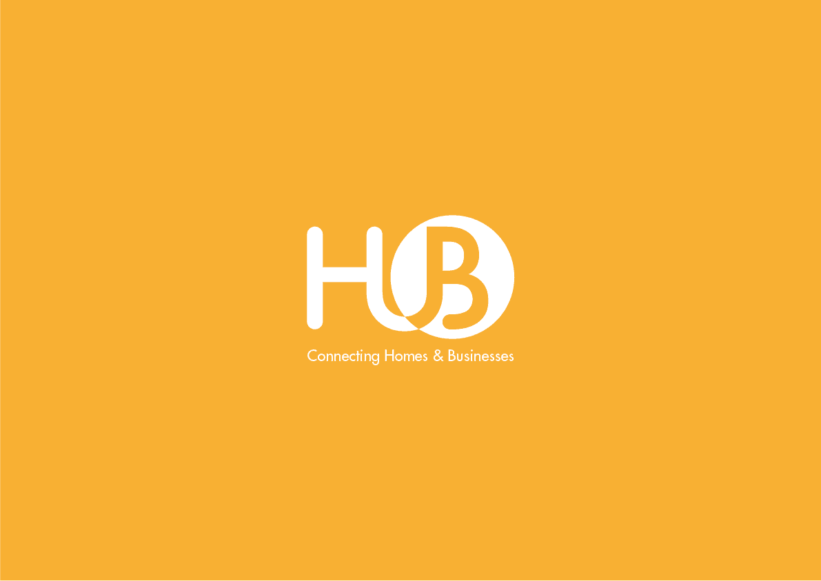
HuB worked because it carried both meanings at once. As a word, it describes a centre, a place where things converge. As a typographic construction (with the lowercase "u" between two capitals), the letters themselves told the story: H for homes, B for businesses, with the connector quietly between them.
The supporting line, "Connecting Homes & Businesses", made the function explicit, anchoring the brand for first-time audiences without forcing the logo to over-explain itself.
THE BRAND MARK — FUNCTION AS FORM
The most important decision in the entire project happened at the wordmark stage. Rather than design a logo and then layer meaning onto it, the wordmark was designed to perform the platform's function visually.
The result: the H and the B are joined by a U-shaped connector, a curve that loops from the bottom of the H to the bottom of the B, literally connecting the two letters. The "U" is both a typographic element (the lowercase letter that completes the word "HuB") and a graphic device (the connector that makes the platform's purpose visible at a glance).
That single decision turned a name into a piece of brand architecture. The logo wasn't decorating the idea, it was the idea.
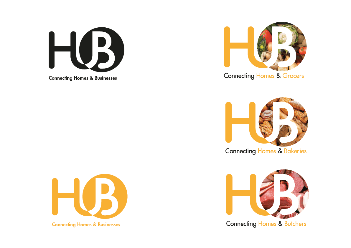
THE FLEXIBLE "B"
The second strategic decision was designing the system for extensibility from the first sketch. A marketplace platform serving neighbourhood businesses needs to communicate across many different business categories, and the brand needed to handle that range without fragmenting.
The solution was to treat the "B" in the logo as a flexible window. The negative space inside the letter could be filled with category-specific imagery — vegetables for grocers, bread for bakeries, meat for butchers, and so on for any future category the platform added.
This created a system where:
The base logo identifies the platform itself (HuB: Connecting Homes & Businesses)
Sub-brand variants identify specific categories (HuB: Connecting Homes & Grocers, HuB: Connecting Homes & Bakeries, HuB: Connecting Homes & Butchers)
The variant logos remain instantly recognisable as part of the same brand family
The system can extend infinitely without requiring redesign, any new category simply gets its own imagery in the "B" window
This is the kind of brand architecture that platform companies rely on: a single identity that scales across categories, audiences, and use-cases without losing coherence.

ADVERTISING ROLLOUT
The brand identity was then extended into a full advertising creative suite to demonstrate how the system performs at scale.
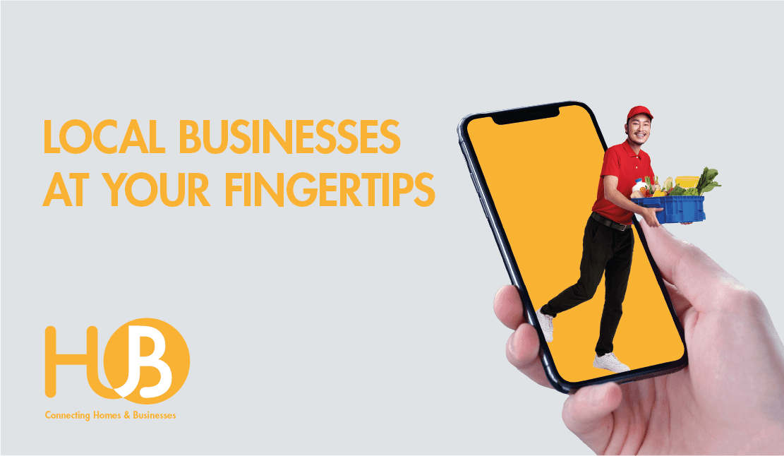
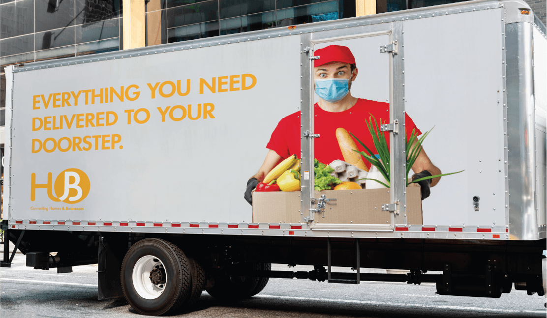
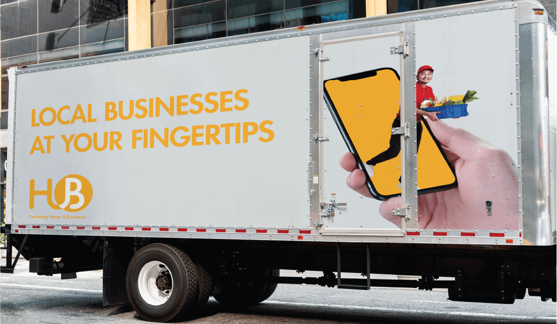
Out-of-home advertising: Two campaign concepts were developed: an orange-and-warm palette built around a delivery driver carrying a box of fresh produce ("Everything you need delivered to your doorstep"), and a complementary execution showing a delivery driver stepping out of a phone screen to demonstrate the in-app experience ("Local businesses at your fingertips"). Both treatments were applied across truck-side advertising, billboard, and digital out-of-home formats.
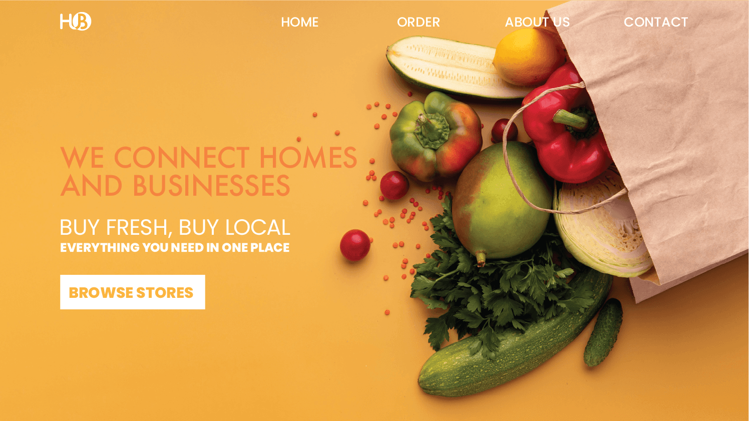
Web presence: A landing page concept anchored around the brand's value propositions ("We connect homes and businesses," "Buy fresh, buy local"), with the visual system extending naturally into the digital experience.
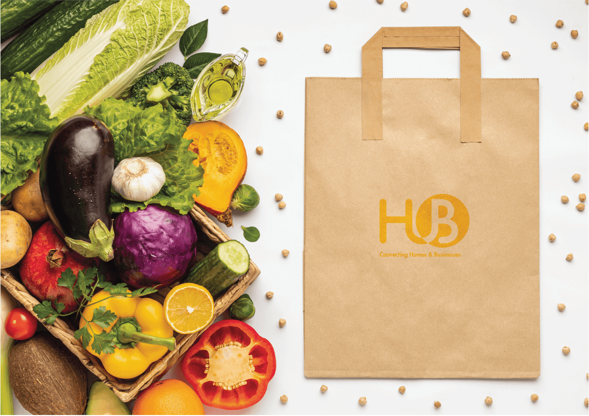
Packaging: A simple, considered kraft delivery bag with the HuB mark applied, the kind of low-cost, high-impact branded touchpoint that gives an independent platform a sense of real-world presence on every doorstep delivery.
THE OUTCOME
HuB sits in the portfolio as a piece of self-directed brand work that demonstrates several things at once: the ability to identify a problem and build a brand to solve it without external direction, conceptual thinking that builds meaning into the structure of the brand mark itself, and brand architecture skills — designing for extensibility from the first sketch rather than retrofitting flexibility later.
It's also an answer to a question that comes up in every design interview: what do you do when no one's giving you a brief?