Escape Evil & Trick or Treat
Parallel Halloween campaigns for the UK's leading escape room brand.

CLIENT
Escape Live
PROJECT YEAR
2024
Role
Graphic Designer
SCOPE
Concept
Campaign identity
Multi-format creative
UK-wide rollout
THE BRIEF
As Escape Live's Lead Graphic Designer, I was responsible for concepting and delivering the brand's seasonal campaigns, an annual creative challenge that required generating fresh ideas for the same audiences year after year, without repeating previous work.
Halloween is the largest single seasonal moment for an escape room brand. The challenge is that the audience splits in two during this period, and the two halves are looking for completely opposite experiences. Adult horror fans want fear, the more visceral, the better. Families with children want fun Halloween-themed but accessible, exciting but not nightmare-inducing.
A single campaign can't speak to both audiences without compromising one of them. So for this Halloween season, I concepted and led two parallel campaigns running side-by-side across all UK Escape Live venues, each with its own identity, tone, and creative system, but coordinated under the same brand umbrella.
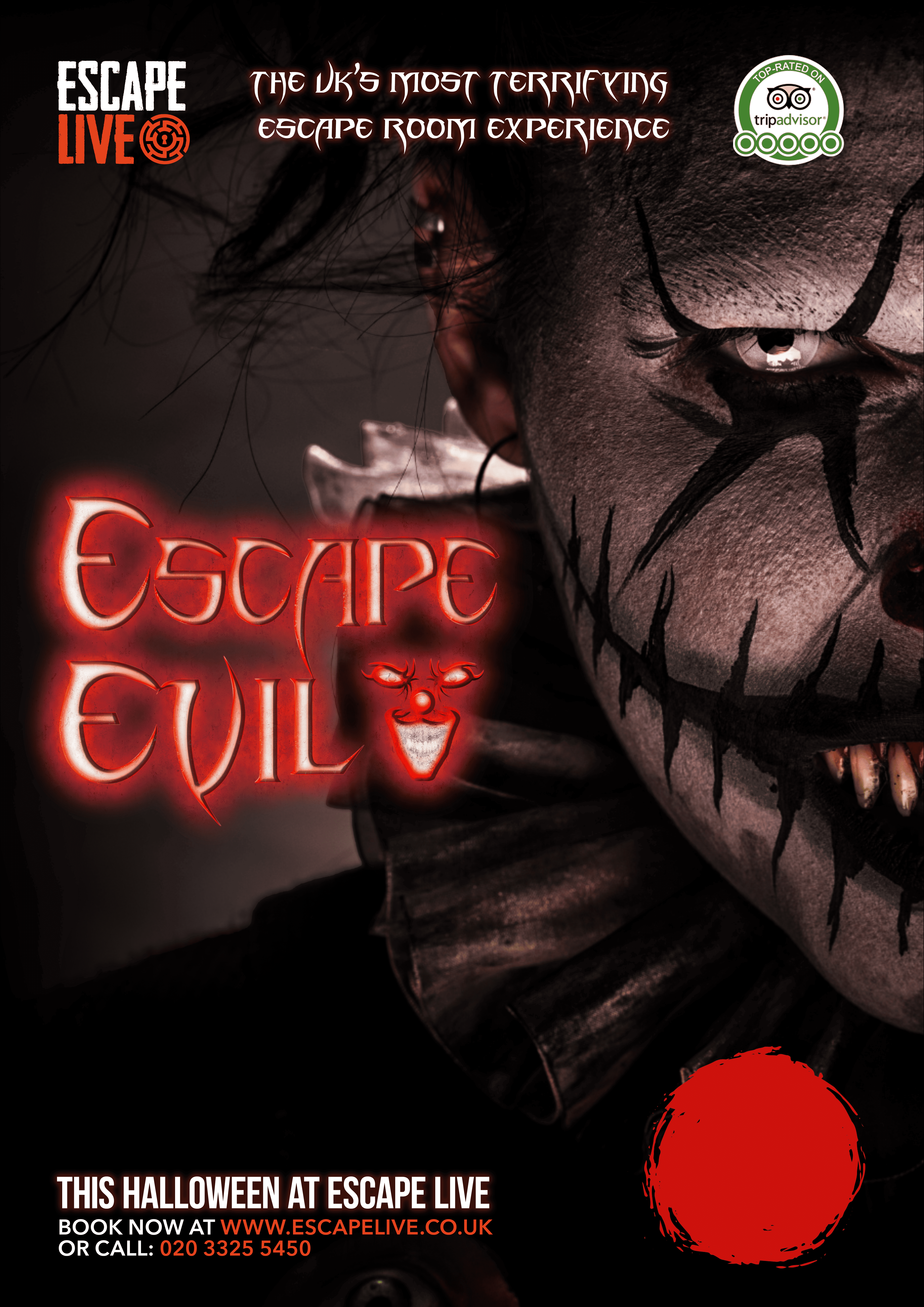
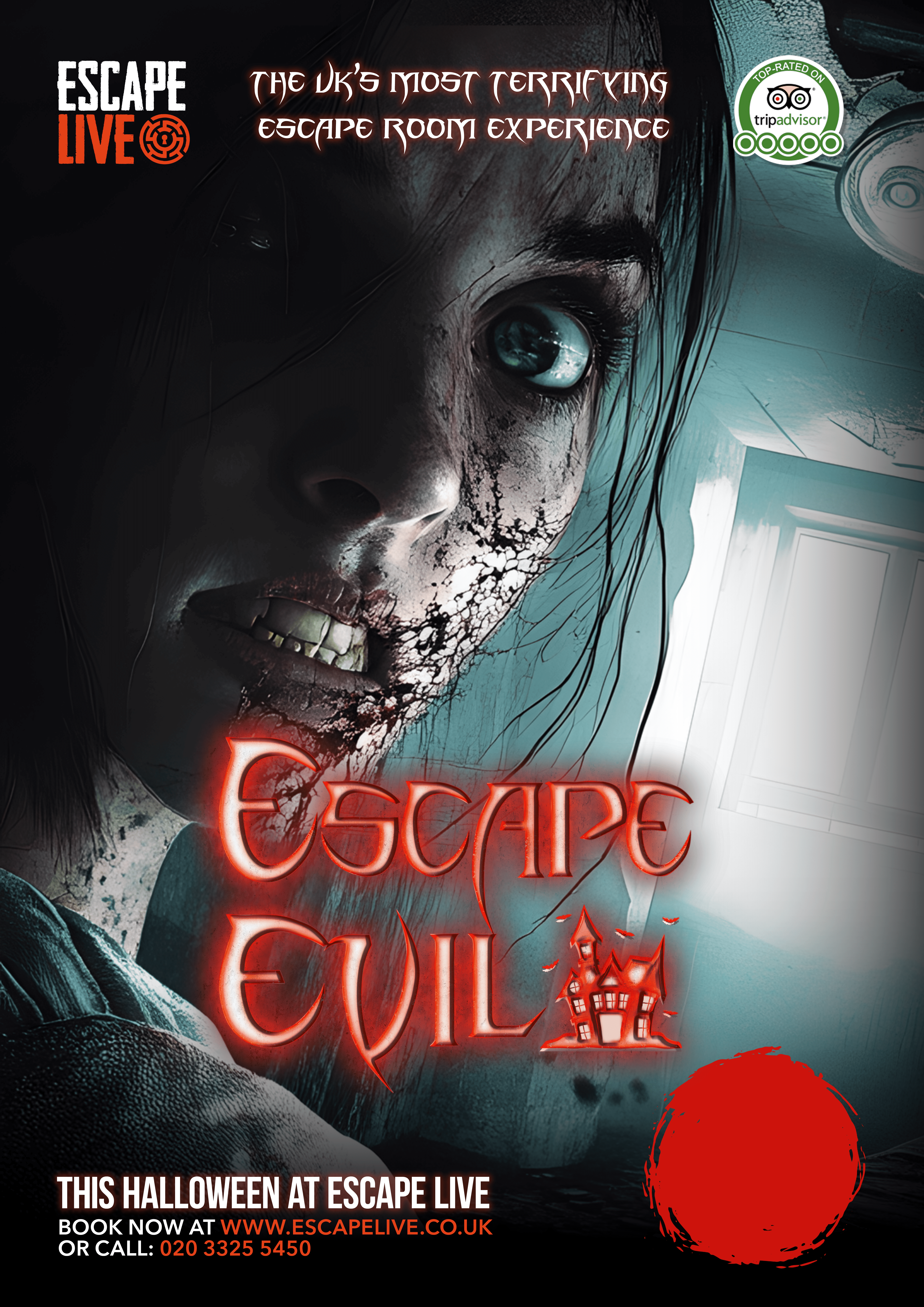
CAMPAIGN ONE: ESCAPE EVIL
Audience: Adult horror enthusiasts, ages 18+ · Positioning: "The UK's most terrifying escape room experience"
Escape Evil needed to be uncomfortable. The horror audience is over-served and hard to impress; safe horror reads as childish. The campaign had to commit to genuine dread or fail.
I built the campaign around four nightmare archetypes, recurring fears that have anchored horror across generations:
The clown: The corrupted-innocence archetype, with red glowing typography against a leering painted face
The witch: The folkloric supernatural archetype, with a smouldering red colour story and a cauldron icon woven into the typography
The decayed: The body-horror archetype, with a wide-eyed pale figure and a haunted-house icon
The apocalyptic: The existential-dread archetype, with a hooded gas-mask figure and a radiation symbol
Each variant uses the same campaign architecture; Escape Evil title lockup with a thematic icon, "The UK's most terrifying escape room experience" tagline, the Escape Live logo, TripAdvisor recognition mark, and consistent CTA placement, but each tells a different fear story. The result is a campaign system that creates four distinct creative assets without fragmenting the brand.
The visual treatment commits hard to atmosphere: deep blacks, blood-saturated reds, distressed typography, and faces lit from below or pushed to extreme close-up. The campaign refused the safer middle ground that Halloween marketing usually settles for.

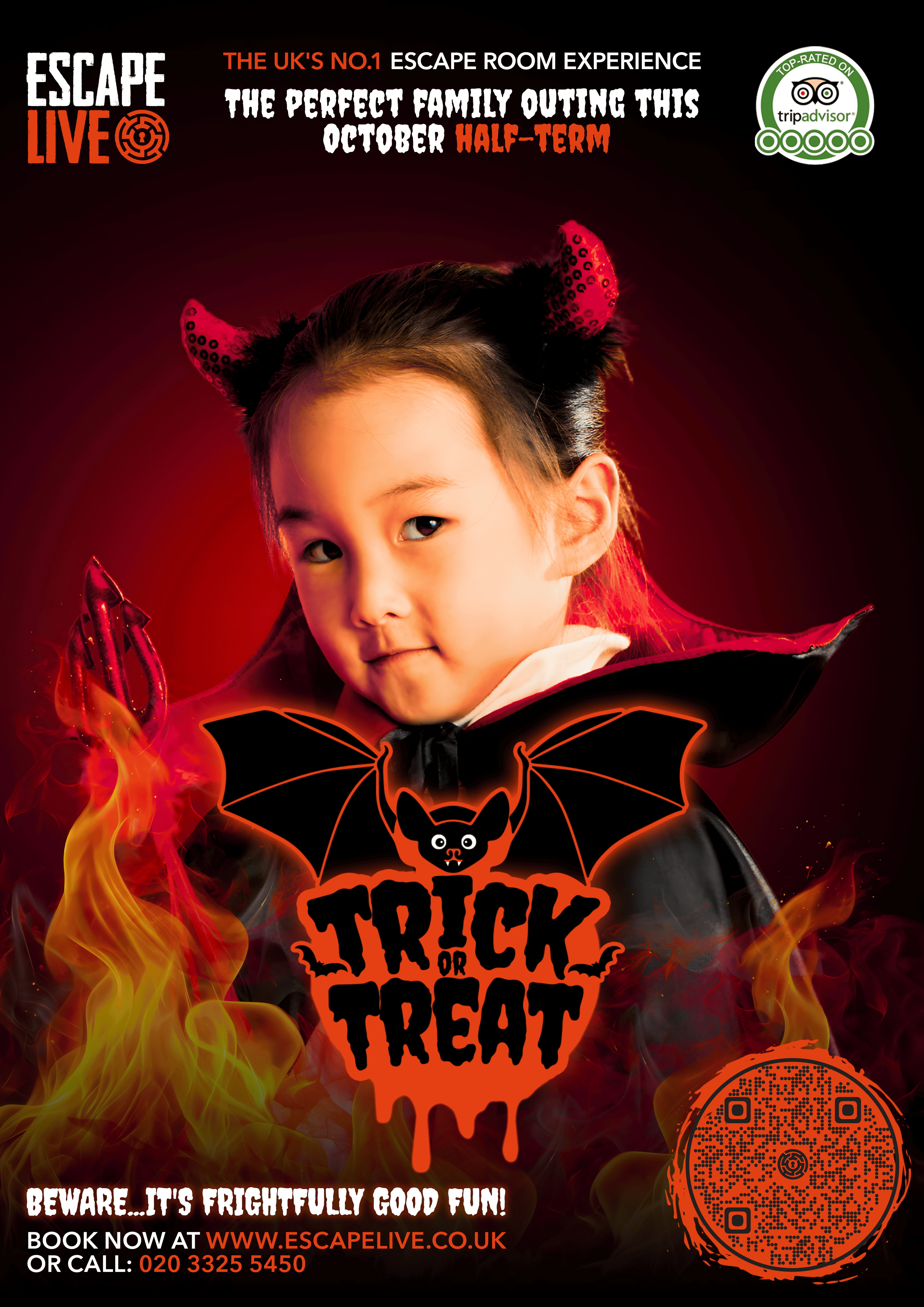
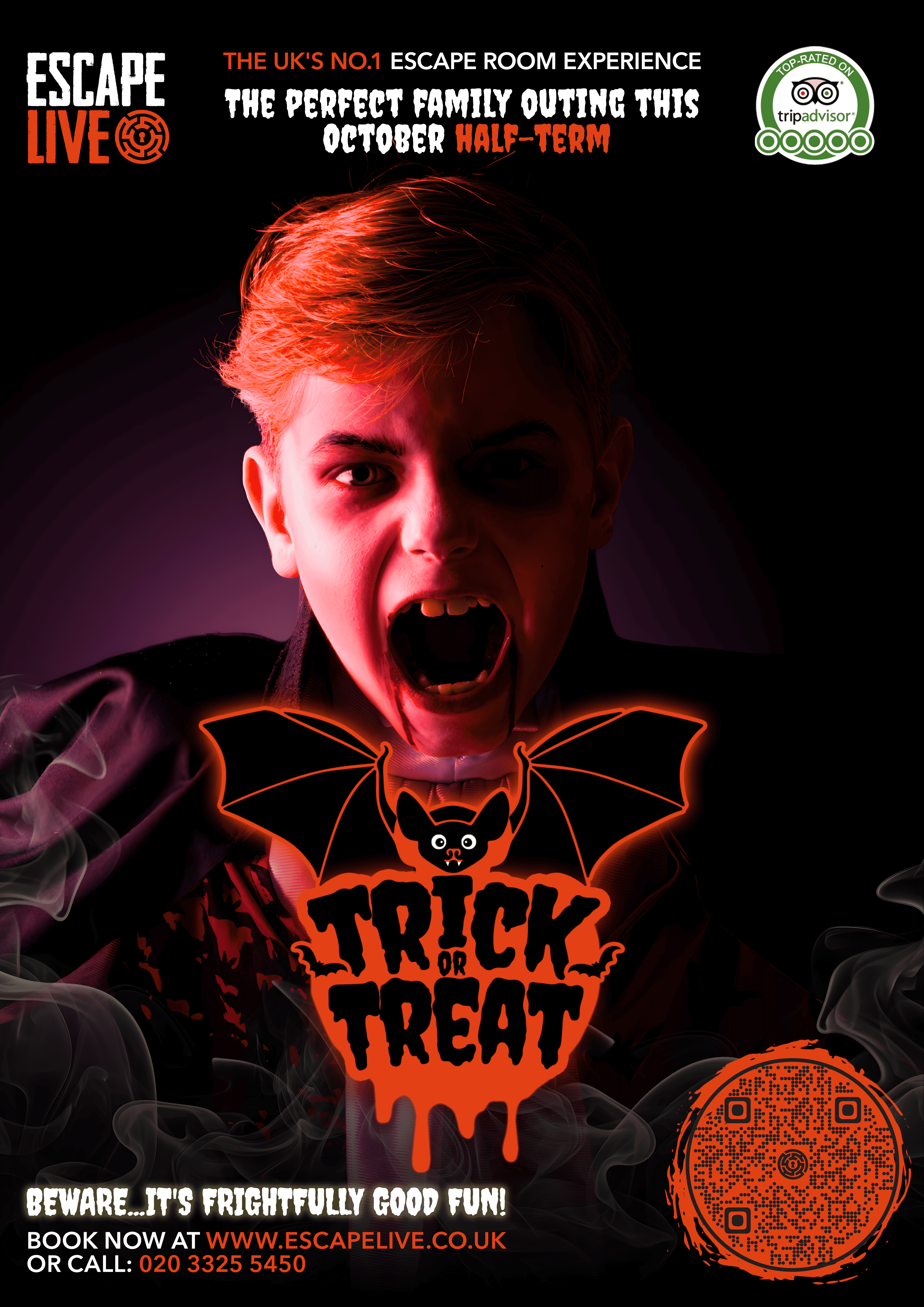
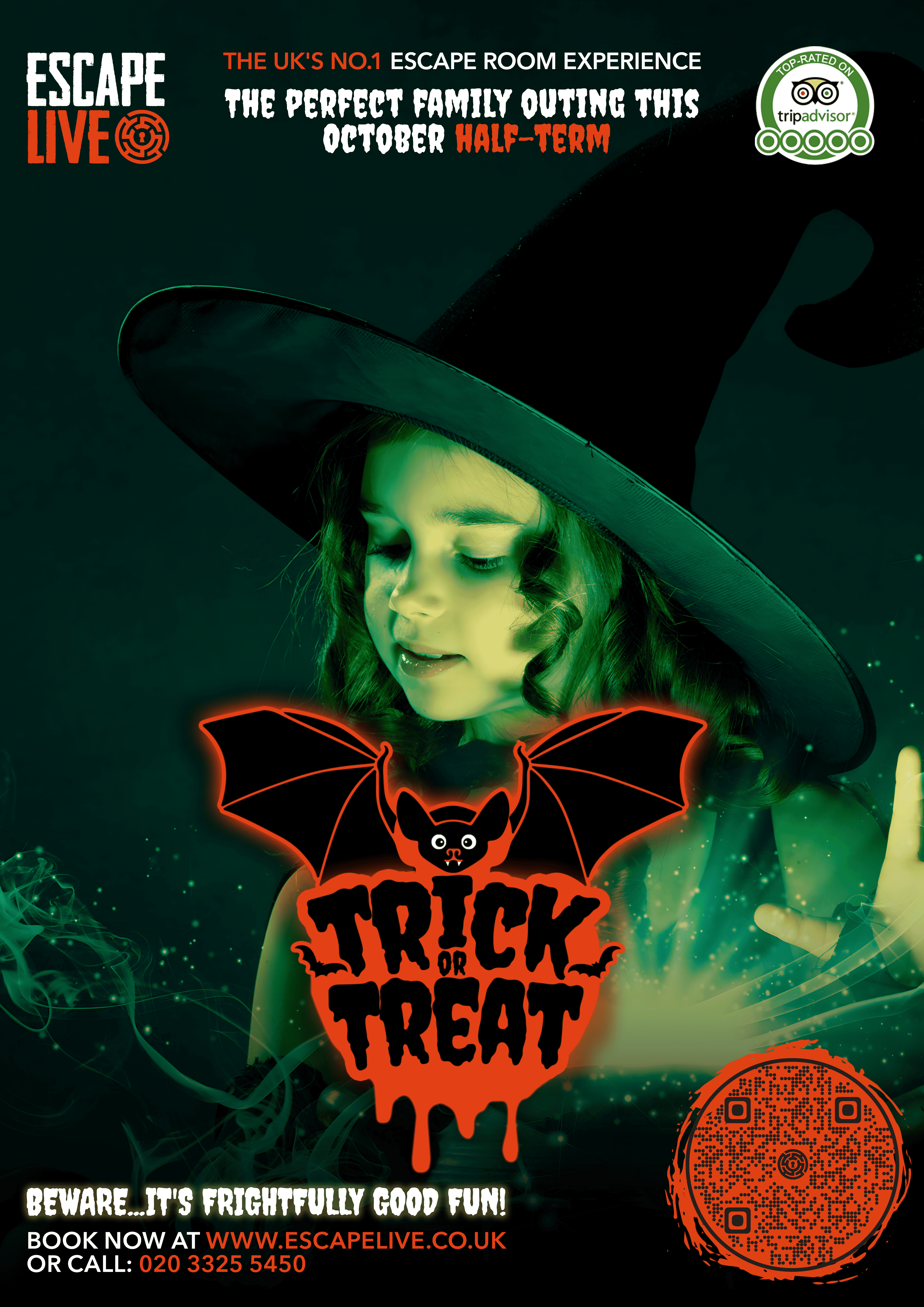
CAMPAIGN ONE: TRICK OR TREAT
Audience: Parents booking half-term outings with primary-school-aged children · Positioning: "The perfect family outing this October half-term"
Trick or Treat needed to be the tonal opposite, and that was harder than it sounds. Children's Halloween marketing tends to fall into two failure modes: it either gets so cute that it loses Halloween energy entirely, or it accidentally drifts toward imagery that's too intense for the audience. The campaign needed to feel like Halloween while staying squarely in family-friendly territory.
I built the campaign around four portrait variants featuring children in Halloween costumes, a small devil, a pumpkin-face, a young vampire, a witch. Each photographed with warm theatrical lighting and surrounded by playful Halloween graphic elements. The "Trick or Treat" lockup was redesigned in a friendlier, dripping-cartoon-paint typographic treatment, anchored by a smiling cartoon bat icon.
The colour palette used Halloween's signature orange and black, but kept the orange warm and inviting rather than glowing or aggressive. The supporting tagline; "Beware… it's frightfully good fun!" leaned into the playful end of Halloween language, signalling clearly to parents that this was kids' entertainment, not a horror experience.

THE STRATEGIC VALUE OF RUNNING THEM PARALLEL
The two campaigns didn't compete with each other, they expanded Escape Live's reach during the most important booking season of the year. Adult horror fans saw Escape Evil and recognised Escape Live as a serious destination for their interest. Parents saw Trick or Treat and recognised Escape Live as a credible family option for half-term.
Running them simultaneously meant the brand could capture both audiences without either feeling alienated. That kind of multi-audience seasonal architecture, built without diluting either creative direction, is what separates brand thinking from campaign thinking.
ROLLOUT
Both campaigns rolled out across every UK Escape Live venue, supporting bookings for the season's Halloween-themed games. Deliverables across both campaigns included social media assets in multiple formats, vertical and landscape advertising creative, web banners, promo video, email marketing, and in-venue display.
SUMMARY
This work sits in the portfolio as an example of leading parallel campaigns under a single brand umbrella, designing for opposed audiences without compromising either creative direction, and delivering across the full multi-format scope that real commercial brand work requires.
It also represents one season's output of an annual responsibility, generating fresh seasonal concepts year after year for a national brand, without repetition, on a recurring schedule. That kind of sustained creative output is one of the realities of in-house lead design work that portfolios rarely capture.